Sounds Good Hypnotic Homepage

Making a listening bar stand out with a website that evokes sound

Context

Sounds Good was a restaurant and listening bar in Toronto’s Little Portugal neighborhood. The bar’s branding featured a series of geometric forms, evoking sound and club aesthetics.

Challenge

Brand designer Rebecca Wilkinson enlisted No Replica to adapt this visual identity into a digital experience. We wanted to bring the static graphics to life without complicating the website’s core purpose as the bar’s menu, drinks, and programming portal for customers.

Solution

No Replica built the visual identity’s core graphic — a series of geometric shapes — using hand-written web code. This enabled us to randomly generate an arrangement each time the site loaded. Furthermore, we could then dynamically shift the arrangement without ever repeating a prior form. The resulting experience is hypnotic, encouraging visitors to sit back, watch, and stay a while.

To ensure the digital experience would remain accessible for customers, we took a restrained approach to the remainder of the site’s design. Every page features the same typeface in the same styling, building a familiar visual vernacular that users could depend on as they navigated the menu. This minimalistic design also significantly simplified the maintenance process for the in-house team. Instead of using a complicated drag-and-drop editor for updating site content, the team could directly edit each page’s text to update the menu, upcoming programming, and business information.

Client

Sounds Good

Services

Digital experience design

Website design

Website development

Computational art

Motion design

Year

2024

The site’s homepage aims to entrance visitors with a hypnotic animation inspired by the brand’s identity. The animation is powered by a custom-coded algorithm that infinitely shifts the shapes without ever repeating a previous arrangement.
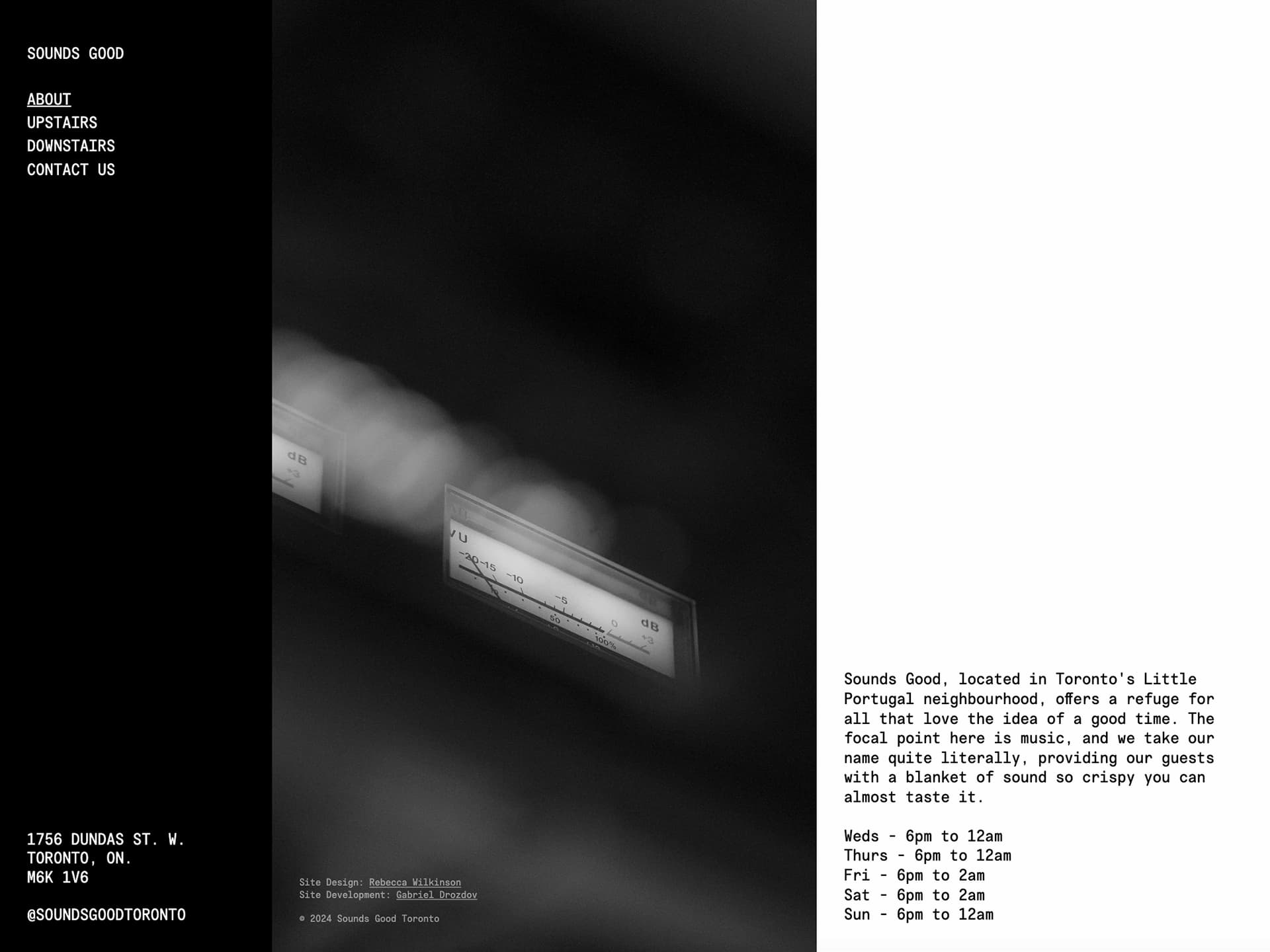
The remainder of the site’s pages take a dramatically different approach, focusing on cut-and-dry layouts with no moving elements. This assured that the site would remain accessible even with a unique homepage design.
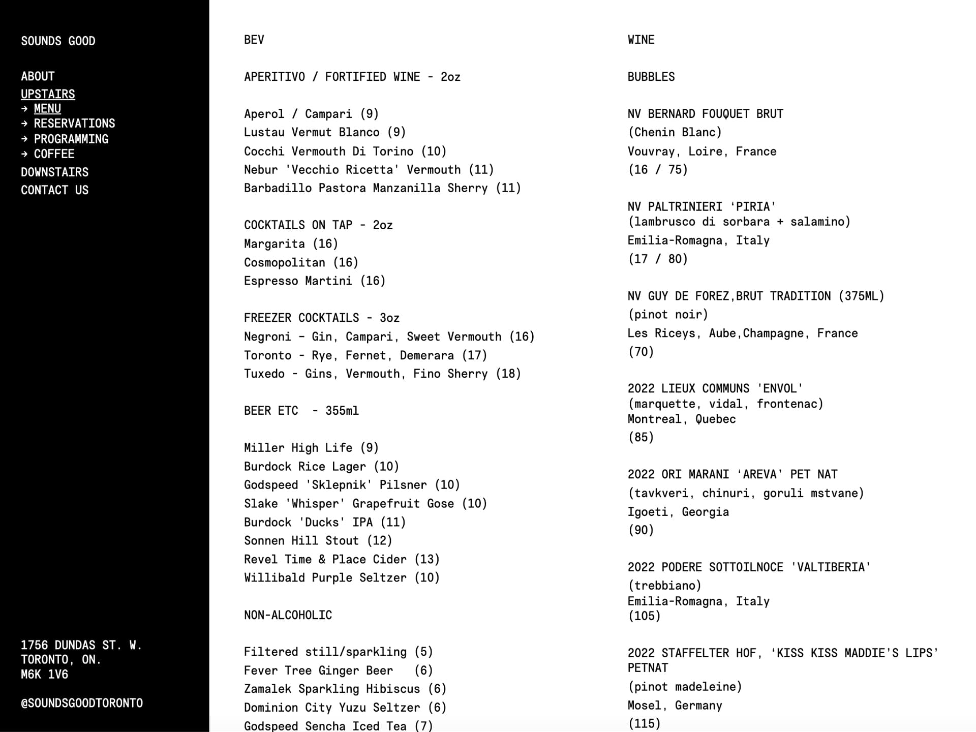
The remainder of the site’s pages take a dramatically different approach, focusing on cut-and-dry layouts with no moving elements. This assured that the site would remain accessible even with a unique homepage design.

All pages used the same monospace typeface in a single size, presented in either one or two columns. By reducing the number of design elements, we simplified the maintenance process for the in-house team while preserving a mysterious and captivating experience for visitors.
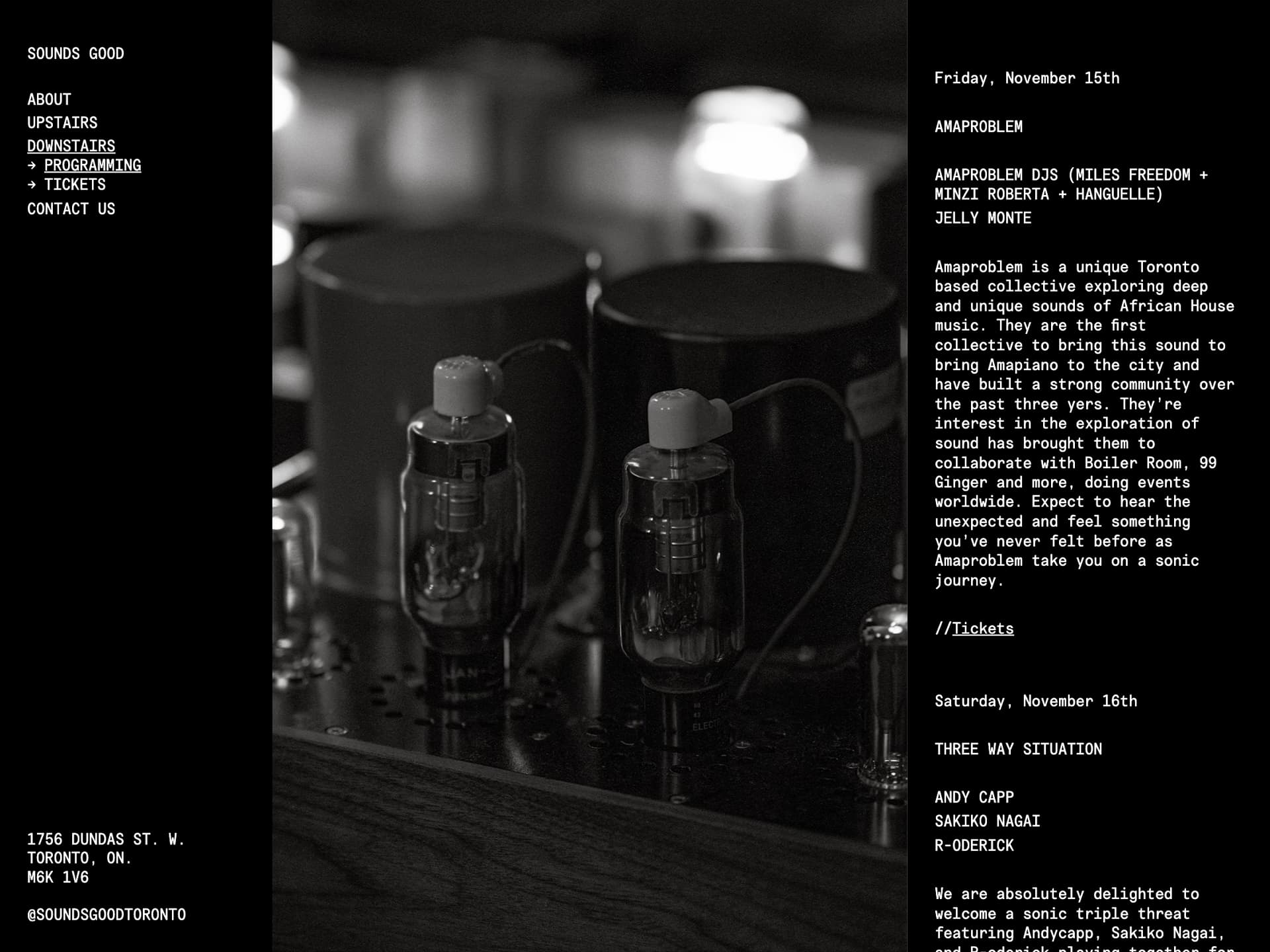
All pages used the same monospace typeface in a single size, presented in either one or two columns. By reducing the number of design elements, we simplified the maintenance process for the in-house team while preserving a mysterious and captivating experience for visitors.

News for upcoming programming and events similarly featured a single column of scrolling text, presented in one font weight and size and paired with an image of the bar’s sound equipment.
News for upcoming programming and events similarly featured a single column of scrolling text, presented in one font weight and size and paired with an image of the bar’s sound equipment.

More projects

More projects! More projects! More projects! More projects! More projects! More projects! More projects! More projects! More projects! More projects! More projects! More projects! More projects! More projects! More projects! More projects! More projects! More projects! More projects! More projects! More projects! More projects! More projects! More projects! More projects! More projects! More projects! More projects! More projects! More projects!

Looking to collaborate?

Hi there! We use cookies to analyze our traffic. By clicking “Accept”, you consent to our use of cookies. Read our policy here.